 "PanchoVilleneuve ST" (PanchoVilleneuve)
06/30/2016 at 11:28 • Filed to: None
 0
0
 19
19
 "PanchoVilleneuve ST" (PanchoVilleneuve)
06/30/2016 at 11:28 • Filed to: None |  0 0
|  19 19 |

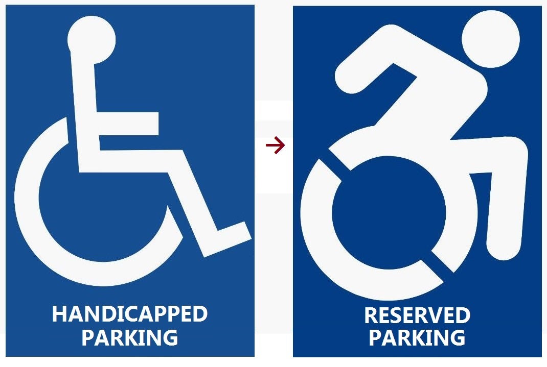
Because the same signs used everywhere else just weren’t good enough, I guess. It’s good to know that we will have special spaces just for falling out of a wheelchair.
Also, someone replace the steering wheels with the new jaunty wheelchair in the Oppo logo thanks.
 Rico
> PanchoVilleneuve ST
06/30/2016 at 11:30 |
|
I prefer the new logo and new wording.
 RamblinRover Luxury-Yacht
> PanchoVilleneuve ST
06/30/2016 at 11:31 |
|
I interpret that as “man escaping from hellish alien sphere capsule”. Or possibly “man breakdancing behind raised manhole cover”.
 PanchoVilleneuve ST
> Rico
06/30/2016 at 11:32 |
|
I too prefer the wording but the universality of the old symbol is why it should not be changed. It would be like replacing stop signs with purple circles.
 For Sweden
> PanchoVilleneuve ST
06/30/2016 at 11:32 |
|
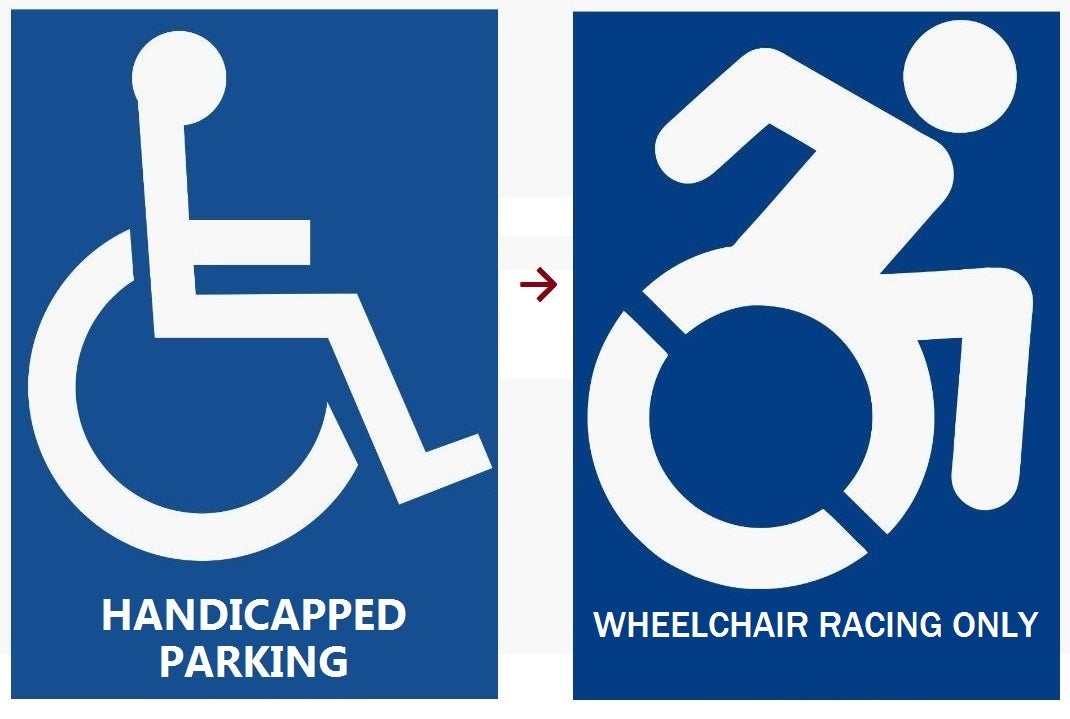
The left is for the handicapped, the right is only for handicapped athletes.
 PanchoVilleneuve ST
> RamblinRover Luxury-Yacht
06/30/2016 at 11:33 |
|
Or “man being chased by Wile E. Coyote can only run with one leg”.
 Ash78, voting early and often
> PanchoVilleneuve ST
06/30/2016 at 11:36 |
|
Alex Zanardi is still deeply offended by the new signs. Not a guy I'd want to piss off.
 RamblinRover Luxury-Yacht
> For Sweden
06/30/2016 at 11:44 |
|
WHEELDO - THE HANDICAP MUTILATOR
 SkyNet
> PanchoVilleneuve ST
06/30/2016 at 11:45 |
|
I interpret it as my tax dollars going to waste in a state that is already hard pressed for dollars.
 PanchoVilleneuve ST
> SkyNet
06/30/2016 at 11:47 |
|
Malloy is insisting that it won’t cost the taxpayer anything.
Also, the state fired all their official sign language interpreters today.
 Dr. Zoidberg - RIP Oppo
> PanchoVilleneuve ST
06/30/2016 at 11:48 |
|
That just makes me think of the South Park episode where everyone has tesitcular cancer
 SkyNet
> PanchoVilleneuve ST
06/30/2016 at 11:50 |
|
I’ve heard that line before. Unless someone is doing the signs for free, it’s costing somebody something.
 Life and Times of Magoo: The People's Champ
> PanchoVilleneuve ST
06/30/2016 at 11:52 |
|
Old one is guy sitting being pushed. New one is on the go pedal.
Jaloponaught Approved
 That Bastard Kurtis - An Attempt to Standardize My Username Across Platforms
> PanchoVilleneuve ST
06/30/2016 at 11:55 |
|
Looks like a Pokemon called ‘stickman’ emerging from a Pokeball.
 Steve is equipped with Electronic Fool Injection
> PanchoVilleneuve ST
06/30/2016 at 12:06 |
|

 RamblinRover Luxury-Yacht
> PanchoVilleneuve ST
06/30/2016 at 12:08 |
|

Maybe they could outsource to South Africa.
 Chariotoflove
> PanchoVilleneuve ST
06/30/2016 at 12:27 |
|
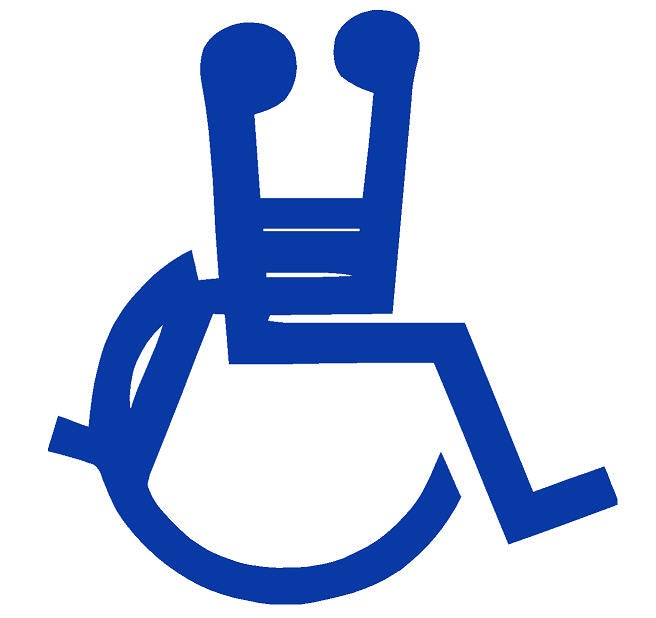
I would pay a little extra to get the old signs replaced with this, at least in hotel parking lots:

 for Michigan
> PanchoVilleneuve ST
06/30/2016 at 12:39 |
|
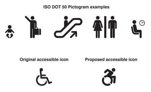
Started by an activist in NY. Allegedly, the standard international symbol for handicapp access created in 1968 depicts a body at rest while the rest of our standardized symbols depict bodies in motion.

Here’s the actual image used by the activist to make her argument . Personally, I don’t see it. Though I do welcome a symbol that has been update to be in line with the rest of the symbols we use as the old one doesn’t really look like it belongs.
 BugEyedBimmer - back in the Saddle Dakota Leather
> PanchoVilleneuve ST
06/30/2016 at 12:59 |
|
It looks like some dude high-stepping over his huge dick. Is that supposed to make the handicapped feel better about themselves?
 BorkBorkBjork
> RamblinRover Luxury-Yacht
06/30/2016 at 15:32 |
|
I keep thinking Portal when I see that.